I was the art director for this project and oversaw the overall vision of the branding, user experience, and implementation of the project. We had a team of two graphic designers, besides myself, who helped extensively with this project. We also had a lot of help from our video production specialist.
Our timeline was approximately three months to design and build the trailer.
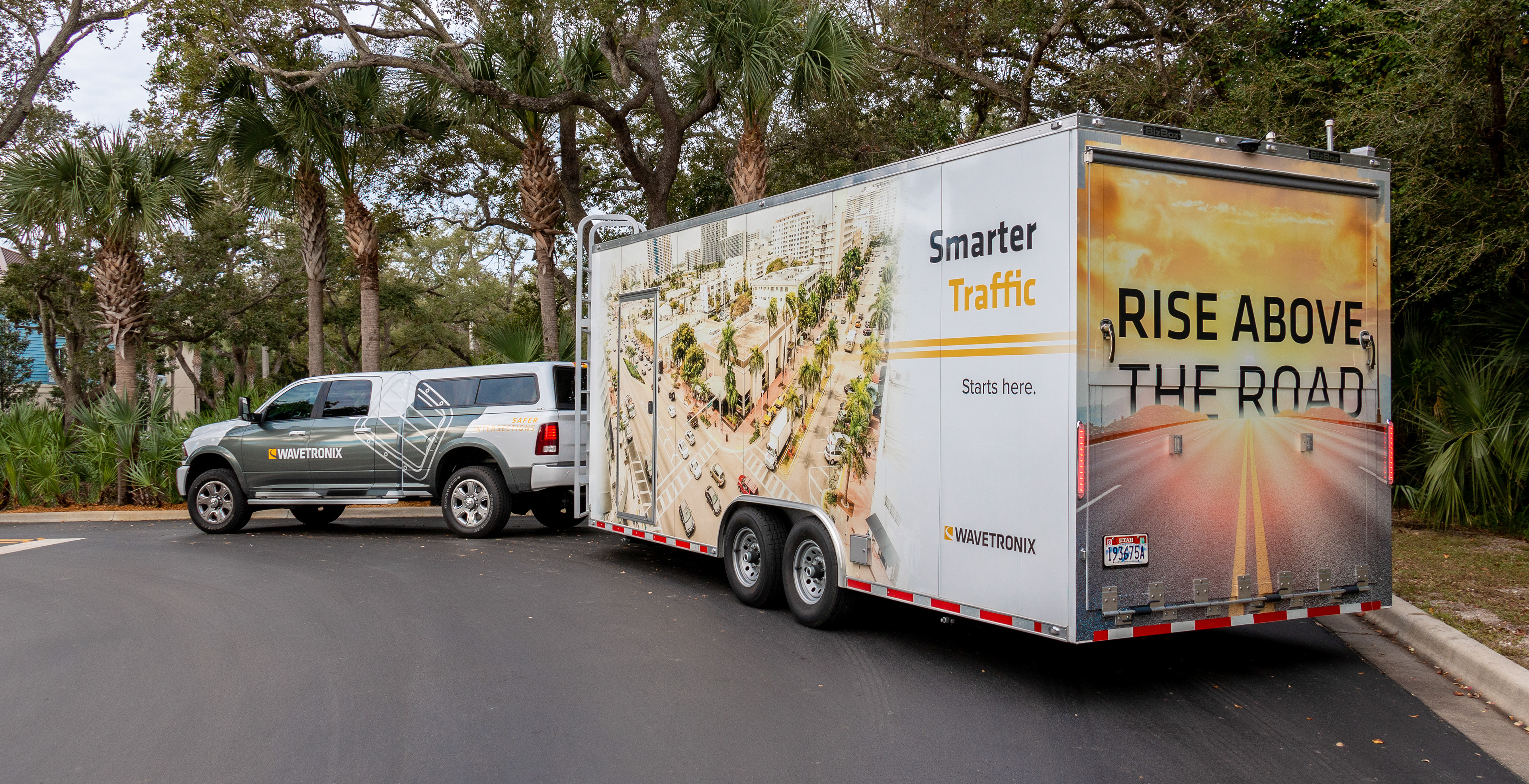
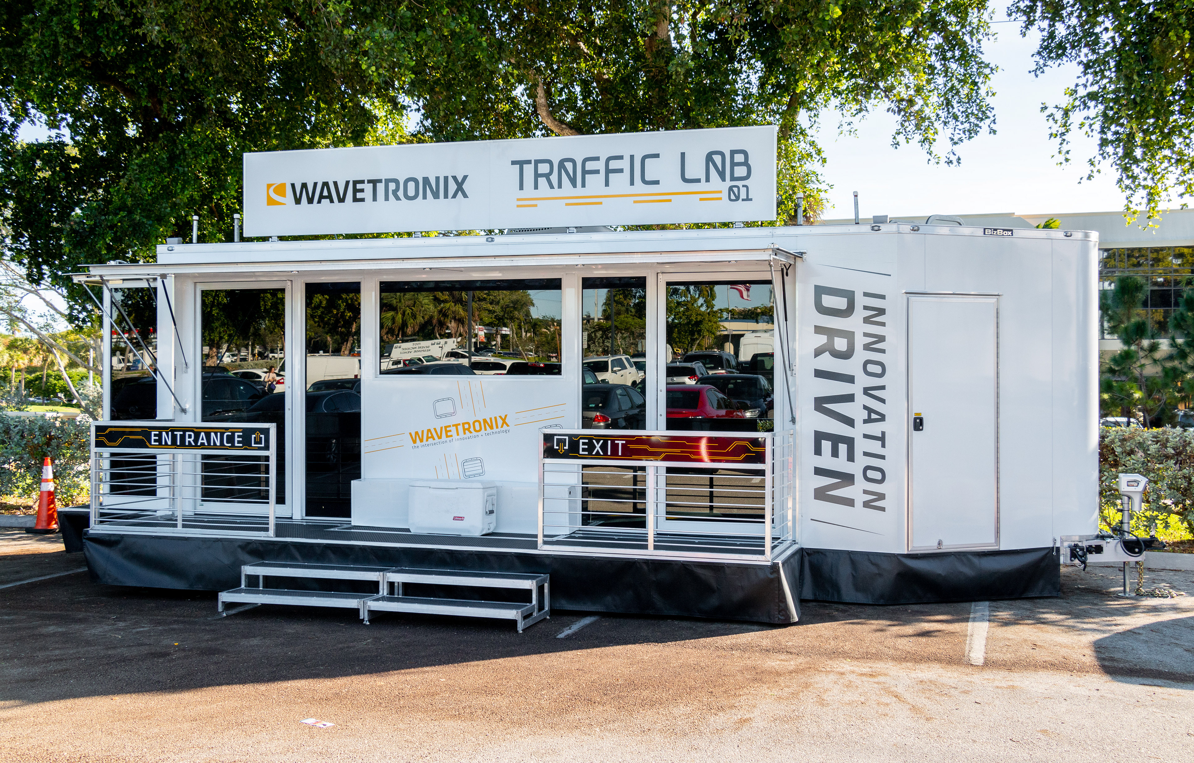
Trailer Exterior
The exterior of the trailer not only serves as a point of interest for the potential visitor but also a traveling billboard to highlight our company. We decided to focus on three separate messages, one on each side, since it is impossible to view two sides at once. One side would highlight what the trailer is actually about, the Wavetronix Traffic Lab; another side highlighted our message of rising above the road, vs our competition; and the last side contained a local image and our slogan, Smarter Traffic Starts Here.

Trailer Interior
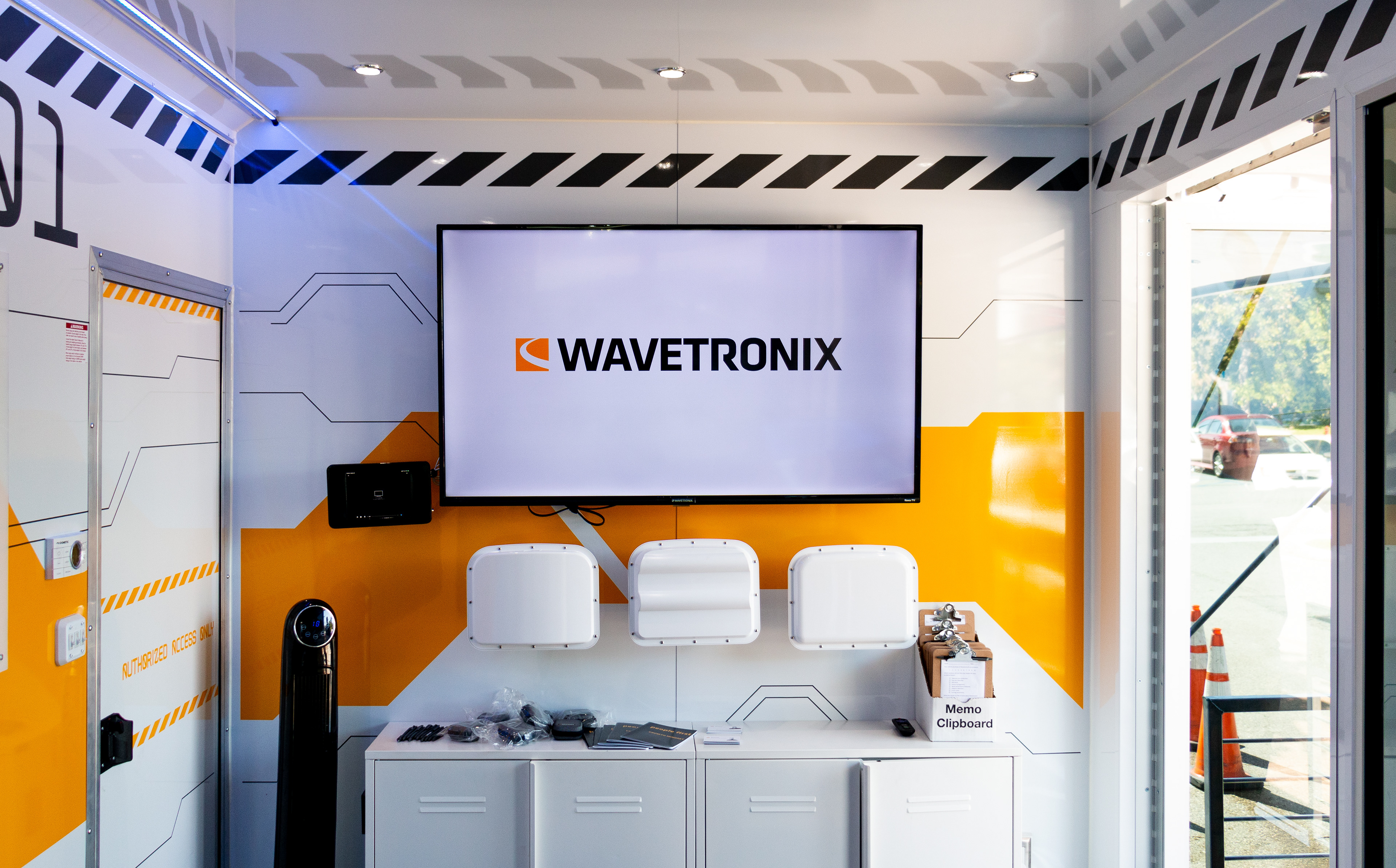
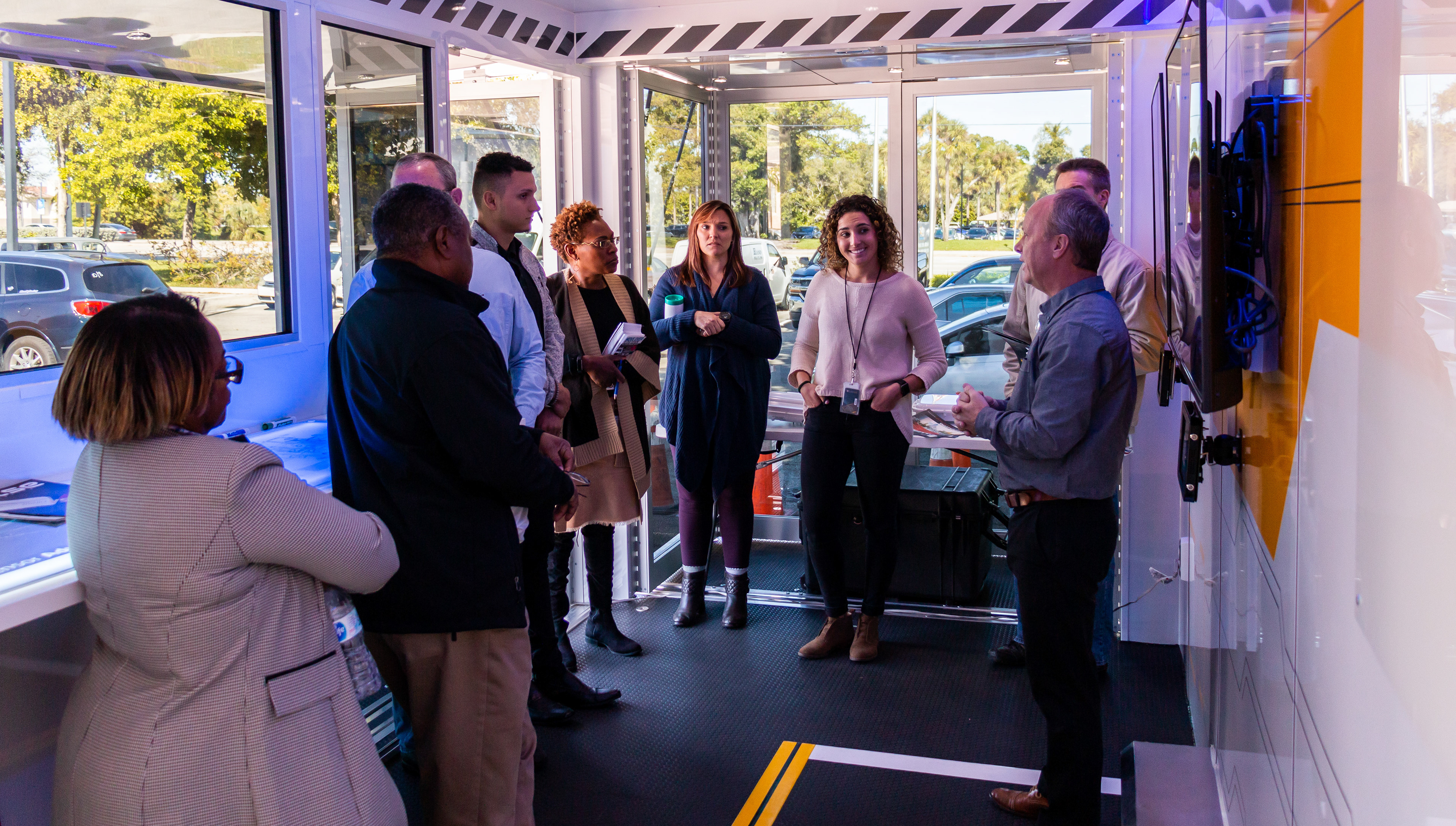
The user experience of the trailer was considered extensively when designing the interior of the trailer. We decided that flexibility was key so we designed the experience to be either self-guided or presented.
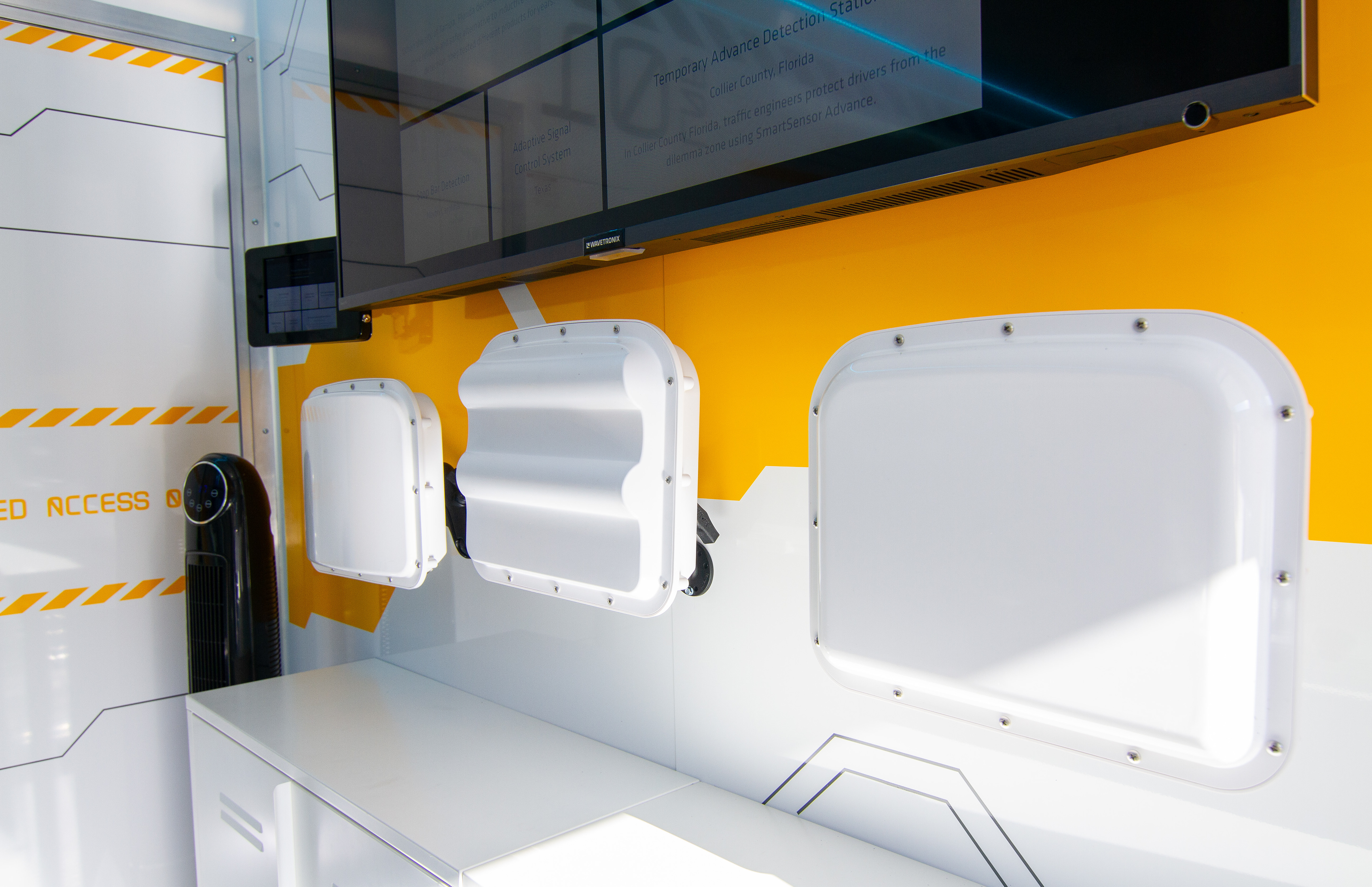
Kiosks were provided that demonstrated some of our unique features in a simple format for participants to guide themselves through. Larger presentations would be displayed on the tv screens that could be enjoyed by a crowd. These could be initiated by either a participant or presenter.
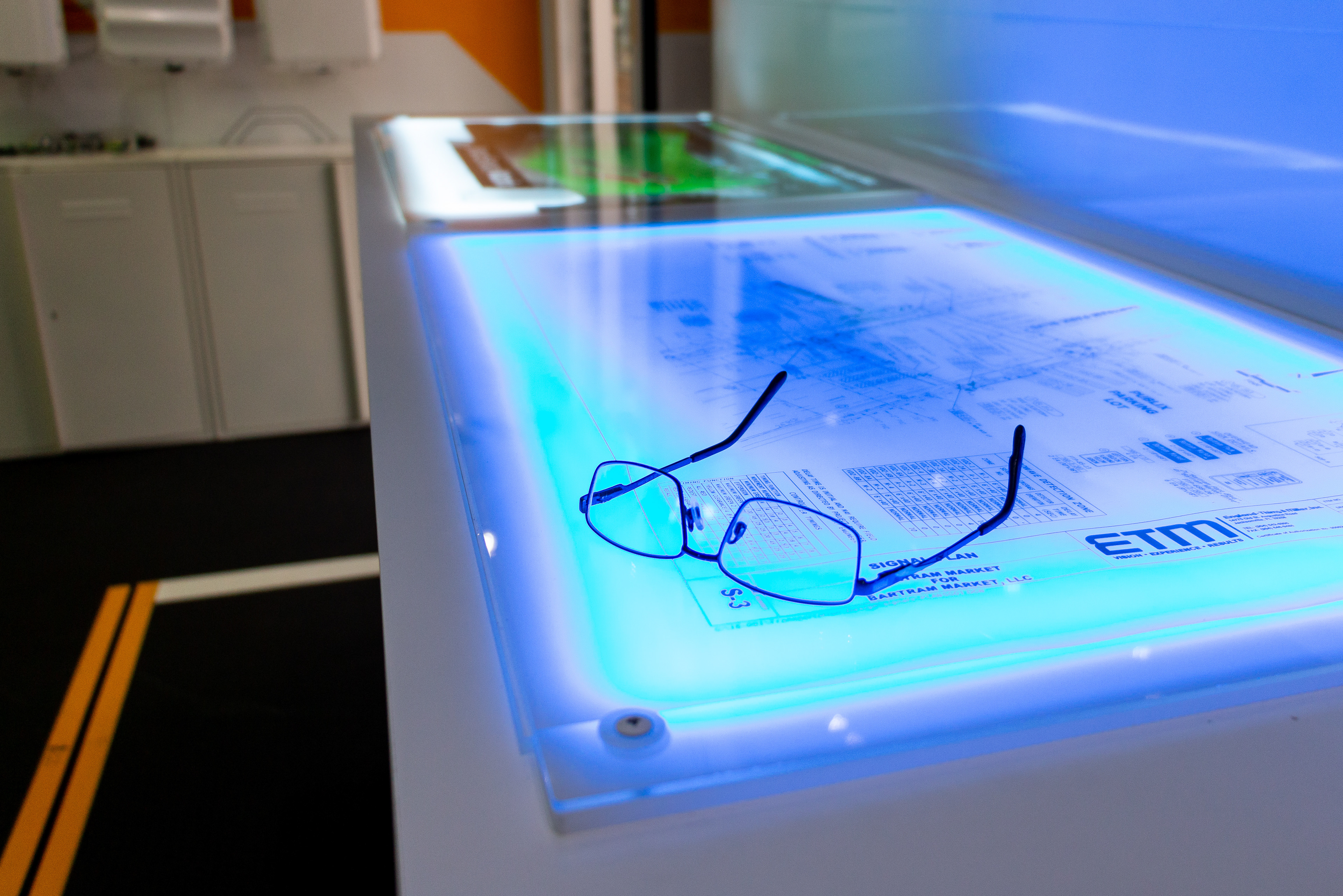
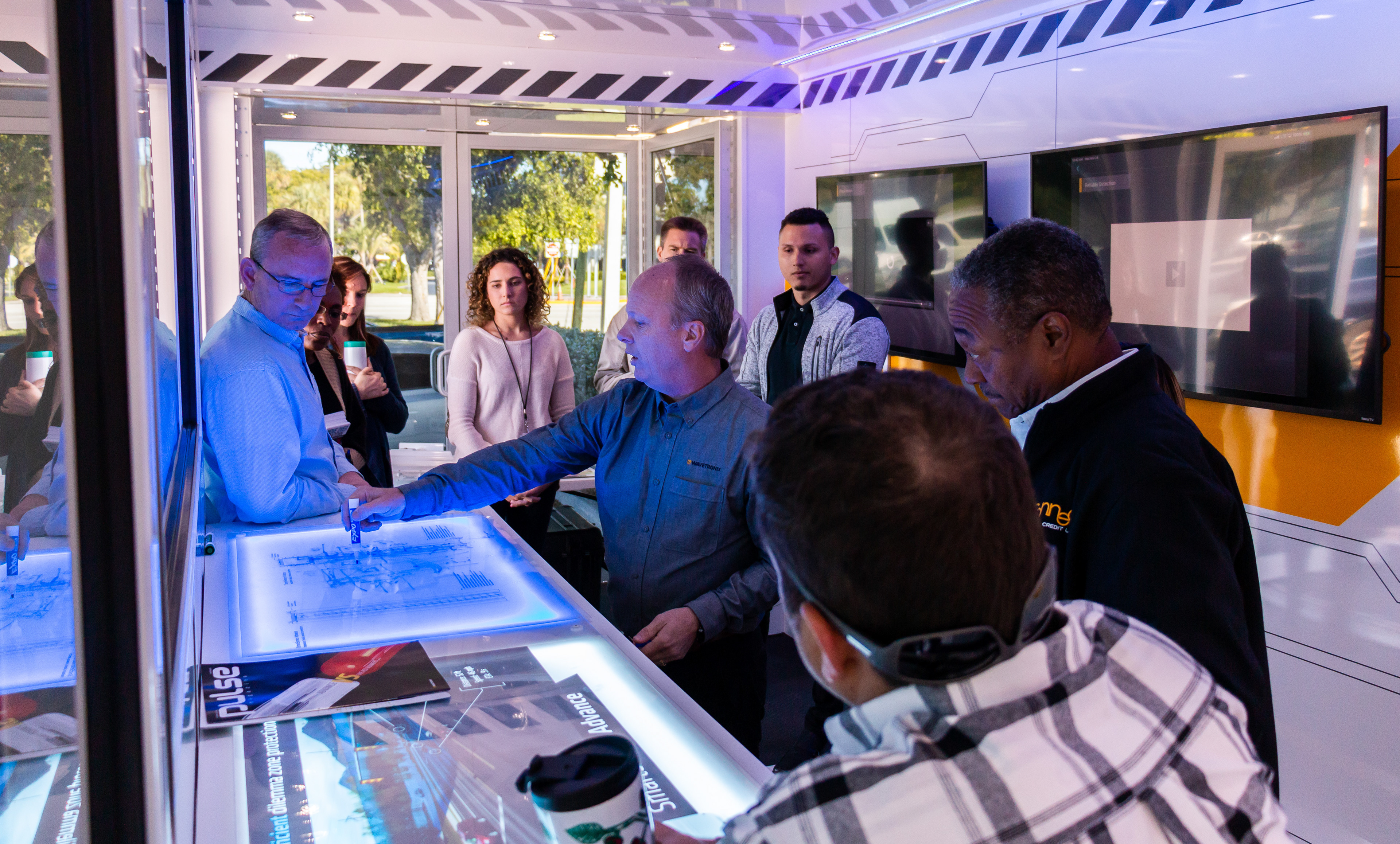
One of my favorite features was the light table. This was designed to facilitate one-on-one discussions with customers and allow the presenter to quickly sketch ideas using different transparent films.
Motion Graphics
We decided early on that the most captive experience for the participants was one that focused on video/animation. This was something rather new for the team and we were excited to give it a try. After deciding on a style for the animations, my team and I put together the graphics that we would use. We then handed off the graphics to our video specialist to animate.
One of the challenges we were facing was how to animate the text in a fun way that was still easy enough to read. We wanted to add delight to the experience without causing frustration. We also faced the challenge of making the two videos feel unique, so the user could recognize that it wasn't the same video twice.

Post Mortem
I was given the opportunity to help with the trailer once it was presented face-to-face with customers. We quickly discovered some areas where we could improve the experience and have already implemented some changes.
One of the biggest changes we decided to implement was the removal of the self-guided kiosks. We found that the majority of our customers were hesitant to interact with the kiosks unless they were guided by a presenter. We instead, moved the content from the kiosks to the larger TVs to facilitate presenting to a crowd instead.